Your website doesn’t have to look like it was designed during a caffeine crash in 2009. A few CSS tricks can elevate your site from “meh” to “okay this person has some standards.”
Here are 10 practical, easy-to-steal CSS tricks to instantly polish your site and make people think you know what you’re doing. (Even if you don’t.)
1. Use CSS Variables for Consistent Styling
Your design should not be held together with duct tape and repeated hex codes. Enter CSS variables:
:root {
  --primary-color: #3498db;
  --font-heading: 'Poppins', sans-serif;
}

h1 {
  color: var(--primary-color);
  font-family: var(--font-heading);
}
Congratulations, you now look like you care about design systems.
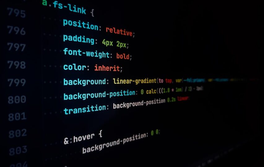
2. Subtle Hover Effects (Not the 2008 Neon Glow)
Gentle transitions make your site feel alive—but not like a rave.
button {
  background-color: #3498db;
  transition: background-color 0.3s ease;
}

button:hover {
  background-color: #2980b9;
}
People love buttons that don’t scream at them.
3. Box Shadows that Whisper, Not Yell
Use shadows like seasoning—just enough to add flavor.
.card {
  box-shadow: 0 2px 8px rgba(0, 0, 0, 0.1);
}
Stop using box-shadow: 0 0 20px red; unless your aesthetic is “90s hacker blog.”
4. Responsive Typography with Clamp()
Text that scales like a well-adjusted adult.
h1 {
  font-size: clamp(1.5rem, 4vw, 3rem);
}
This tells the browser: “Hey, scale between 1.5rem and 3rem, depending on screen size.” And for once, the browser listens.
5. Smooth Scrolling
Give your links that slick, buttery scroll behavior.
html {
  scroll-behavior: smooth;
}
It’s the difference between “meh” and “mmm yes, quite delightful.”
6. Use object-fit for Better Image Cropping
Stop stretching your images like they’re made of taffy.
img {
  width: 100%;
  height: 200px;
  object-fit: cover;
}
Now your thumbnails won’t look like cursed relics from an image distortion lab.
7. Accent Borders with Gradients
Flat borders are fine, but gradient borders? Fancy.
.border-gradient {
  border: 3px solid;
  border-image: linear-gradient(to right, #ff7e5f, #feb47b) 1;
}
It’s like putting on a tie. Is it necessary? No. But it looks sharp.
8. Custom Scrollbars (Because Why Not?)
Give your scrollbars a glow-up. Works best in WebKit browsers.
::-webkit-scrollbar {
  width: 10px;
}

::-webkit-scrollbar-thumb {
  background: #888;
  border-radius: 5px;
}
Just don’t go overboard. This isn’t Myspace.
9. Maximize Layout with Flex and Grid
Stop floating things like it’s 2012.
.container {
  display: grid;
  grid-template-columns: repeat(auto-fit, minmax(250px, 1fr));
  gap: 2rem;
}
Makes your layout flexible, modern, and not a total trainwreck on mobile.
10. Dark Mode (for the Mysterious Developer Aesthetic™)
Support dark mode with a media query and a little sass.
@media (prefers-color-scheme: dark) {
  body {
    background-color: #121212;
    color: #f5f5f5;
  }
}
Because some users just want their retina displays to suffer.
🔚 Conclusion
Looking “professional” isn’t about animations and 3D parallax unicorn gradients. It’s about clean design, subtle touches, and not horrifying people with your font choices.
Use these CSS tricks to add polish without the pain, and maybe—just maybe—someone will look at your site and say: “Hey, this doesn’t suck.”